Extension
The recommended way to customize the editor is creating an extension, even if the change is small, because you can quickly enable/disable it, and reuse it for other projects.
The extension must be a component that is created by extending the Component base class.
import { Component } from '@ryusei/code';


export class MyComponent extends Component {
  ...
}
To make the extension work, you need to compose it by the RyuseiCode.compose():
import { RyuseiCode } from '@ryusei/code';
import { MyComponent } from 'path-to-your-extension';


RyuseiCode.compose( { MyComponent } );
Visit this page for more details about the Component class.
Small Example
This example displays a log message on the console every time when the focus line changes:
import { Component } from '@ryusei/code';


export class MyComponent extends Component {
  mount( element ) {
    this.on( 'focusLineChanged', () => {
      console.log( `Line: ${ this.Selection.focus[ 0 ] }` );
    } );
  }
}
RyuseiCode invokes the mount() method after:
- mounting all core components
- collecting all essential elements
The component class exposes all core components as member properties. The example above gets the focus position from the Selection component.
Advanced Example
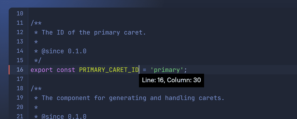
Let's take a look on more complex extension. In this example, we will create a popup UI that displays current location on the bottom of the caret.
First, create an element for the UI and append it to the overlay element that displayed in the foreground of the editor.
import { Component } from '@ryusei/code';


export class MyComponent extends Component {
  mount( element ) {
    super.mount( elements );
    this.create();
  }


  create() {
    this.popup = document.createElement( 'div' );
    this.elements.overlay.appendChild( this.popup );


    this.setStyles( {
      position  : 'absolute',
      background: 'black',
      color     : 'white',
      padding   : '.2em .5em',
      display   : 'none', // Hide it initially.
    } );
  }


  setStyles( styles ) {
    Object.keys( styles ).forEach( prop => {
      this.popup.style[ prop ] = styles[ prop ];
    } );
  }
}
The setStyles method is just a utility function to set inline styles to the popup element.
Next, display it when users move the caret. We can accomplish that by observing the selection states:
export class MyComponent extends Component {
  mount( element ) {
    super.mount( elements );
    this.create();
    this.listen();
  }


  ...


  listen() {
    this.on( 'selected', ( e, Selection, state ) => {
      if ( state === Selection.STATES.COLLAPSED ) {
        this.show();
      } else {
        this.hide();
      }
    } );
  }


  show() {
    this.setStyles( { display: 'block' } );
  }


  hide() {
    this.setStyles( { display: 'none' } );
  }
}
RyuseiCode fires the selected event whenever detecting change of the selection state.
The code above shows the popup element when the selection is collapsed, and otherwise hides it.
Finally, move the element on the bottom of the caret:
export class MyComponent extends Component {
  mount( element ) {
    super.mount( elements );
    this.create();
    this.listen();
  }


  ...


  show() {
    const { rect: caretRect } = this.Caret;
    const { scrollerRect } = this.Measure;


    this.setStyles( {
      display: `block`,
      top    : `${ caretRect.bottom - scrollerRect.top }px`,
      left   : `${ caretRect.left - scrollerRect.left }px`,
    } );


    this.popup.textContent = this.Selection.getLocation();
  }
}
The Caret component provides the DOMRect object
that describes dimensions and positions of the caret,
and the Measure component provides the one for the scroller element.
Because the DOMRect positions are relative to the viewport (window),
we need to calculate offset positions by them.
